

Topological data analysis with Mapper

Introduction
Topological data analysis (TDA) is a recent branch of data analysis that uses topology and in particular persistent homology. TDA is used to extract meaning from the shape of data.
In this article we will explore a particular technique of TDA called the Mapper algorithm introduced by Singh, Memoli and Carlsson in their seminal paper Topological Methods for the Analysis of High Dimensional Data Sets and 3D Object Recognition (2007).
Mapper is a combination of dimensionality reduction, clustering and graph networks techniques used to get higher level understanding of the structure of data. It is mainly used for:
- visualising the shape of data through a particular lens
- detecting clusters and interesting topological structures which traditional methods fail to find
- selecting features that best discriminate data and for model interpretability
A flourishing literature shows its high potential in real data applications and especially in biology and medicine. Created by some founders of the celebrated silicon valley start-up Ayasdi, Mapper is applied in business to customer segmentation, hot spot analysis, fraud detection, churn prediction, drug discovery, socio-economic, sensor or text data as well.
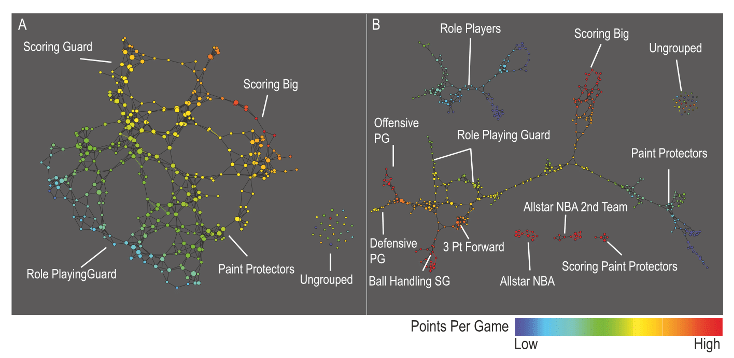
Performance profiles for each of the 452 players in the NBA by using data from the 2010–2011 NBA season. The number of the covering intervals on the left-hand figure is 20 while on the right-hand is 30 (higher resolution). Graphs are colored by points per game and the lens is chosen to be the projection to the principal and secondary SVD values. For more details, see Extracting insights from the shape of complex data using topology. Precise definitions of coverings and lenses are described in Section “The algorithm”.
Topological data analysis for discovery in preclinical spinal cord injury and traumatic brain injury
In this article we will briefly describe what Mapper technically is, reveal the advantages that it carries and show some applications as well as an exploratory case study. In a forthcoming article we will explore how TDA and persistent homology can be used effectively with Machine Learning.
The Algorithm
Given a dataset of points, the basic steps behind Mapper are as follows:
- Map to a lower-dimensional space using a filter function
 , or lens. Common choices for the filter function include projection onto one or more axes via PCA or density-based methods.
 - Construct a cover
 of the projected space typically in the form of a set of overlapping intervals which have constant length.
 - For each interval
 cluster the points in the preimage
  into sets
  .
. - Construct the graph whose vertices are the cluster sets and an edge exists between two vertices if two clusters share some points in common.
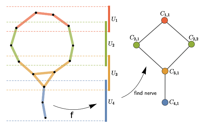
Illustration of the mapper algorithm (source): data is represented by 2-dim black points (on the left), the filter function here is simply a height function (projection onto the y-axis) and four intervals compose the covering of the projected space; after pulling back these intervals, i.e. taking the preimage of the filter function, we cluster each preimage in a nearest neighbour fashion. The resulting Mapper graph is depicted on the right.
The result is a compressed graph representation of the dataset representing well its structure. High flexibility is left in this procedure to the data scientist for fine tuning: the choice of the lens, the cover and the clustering algorithm.
Lenses, coverings and clustering
The choice of the lens is of great importance since the output graph will sensibly depend on this choice. In the one-dimensional case, one could choose some height function (like in the figure above), eccentricity or centrality.
With more dimensions typical choices are standard dimensionality reduction algorithms like PCA, Isomap, MDS, t-SNE or UMAP. Density-based methods such as distance to the first k-nearest neighbors are often used in biological applications (see this book for several examples). More subtle results can be achieved by projecting to some latent space coming from a variational autoencoder.
Depending on what type of dataset you’re analyzing, the most meaningful lenses can be applied. For example, for outlier detection it will make sense to apply a lens projecting to an isolation forest score coupled with L2 norm or first PCA component (see here for one of such examples).
Concerning the cover, a standard choice is a collection of d-dimensional intervals (i.e. a Cartesian product of d one-dimensional intervals) of the same length pairwise overlapping with a specified percentage. This is another crucial parameter since the overlaps will determine the edge creation in the Mapper’s graph.
Lastly you are left with the choice of your favourite clustering technique. DBSCAN or hierarchical clustering are good picks in this context. It could be tricky to choose the number of clusters as hyperparameter globally: clustering is applied to every set of points resulting from the pull-back of an element of the cover, thus there may be sets of points with different numbers of clusters to select. One solution is given by stopping the agglomerative clustering according to a rule, such as spotting the first instance of a sufficiently large gap in the dendrogram (see the Mapper paper for more details).
Mapper’s strengths
Dimensionality reduction methods suffer from projection loss, that is, well separated points in high dimensional space might be projected nearby in lower dimensional space. The advantage of Mapper is that, after choosing the lens, the covering in the projected space is pulled back to the original high dimensional space and clustering happens here. This is a significant improvement with respect to dimensionality reduction since substructures in the original space are found and highlighted. Therefore more pertinent clusters are generally detected.
The topological structure of the original space where data lives is visualised directly in a compressed graph representation. We emphasize the fact that we obtain a graph whose edges exhibit interesting relations between data and clusters. Interesting topological substructures like loops or flares in the mapper graphs can be explored further.
Another winning aspect of Mapper is to help selecting features that best discriminate data. Once groups or interesting connected components are found, the mapper graph allows to explore why data is interconnected: it is easy to see if nodes of the mapper graph are grouped together because certain features have similar value ranges. Thus determining the explanatory variables for the group vs the rest of the data set or vs other groups become easier. The ability to color the network by a quantity of interest, by coloring each node by the average value of the quantity on the points in the collection corresponding to the node permits the explanation of various groups and the distinction of the groups in terms of the most distinguishing variables.
Finally, the mapper visualisation can be used also for model explainability. Assume we have a classification problem and we want to better understand the false positives of our model. Then through the Mapper visualisation we can explore the data structure and get new insights to proceed to error analysis and improve our predictive model.
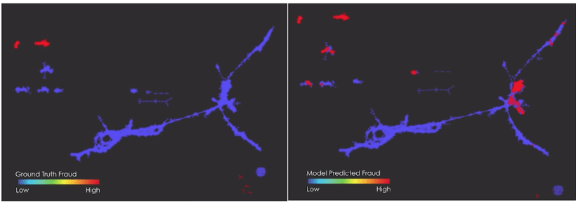
On the left side we see a Mapper graph where red points correspond to ground truth fraud. On the right the same Mapper graph is present with now red points corresponding to predicted fraud. We can now explore where the model misclassified the fraud and characterise errors according to which clusters of the Mapper graph they belong to. This can give useful insight to understand where the model failed in the classification task. Source of the figures: Ayasdi – Building better models using topology
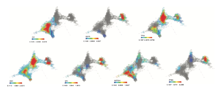
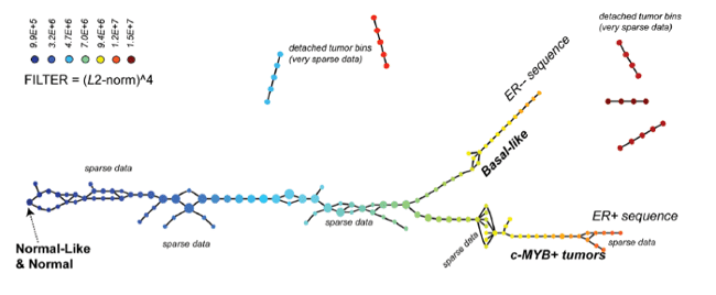
Feature selection with Mapper for identifying driver genes in cancer. Mapper is used to see if patients with a particular alteration present a similar expression profile. Mapper finds three distinct groups with mutated genes. A group enriched in CIC, NOTCH1 and IDH1, another enriched in IDH1 and, TP53 mutations and a last one in EGFR and PTEN mutations. Source: Topological Data Analysis for Genomics and Evolution
Our test
We tested Mapper’s potential with the Heart Disease UCI dataset, a small binary classification dataset used for predicting heart disease in patients from attributes like age, cholesterol, blood pressure, thalassemia, electrocardiographic results, etc.
Nowadays there are a few python open source libraries implementing the main TDA tools, like GUDHI, scikit-tda and Giotto. For our test we chose to use one of the most recent: the Giotto library, which is scikit-learn compatible, oriented towards machine learning, fast-performing with C++ state-of-the-art implementations.
With few lines of code (in pure transformer style) it is possible to easily define a pipeline producing the Mapper graph.
# Define filter function
filter_func = umap.UMAP(n_neighbors=5)
# Define cover
cover = CubicalCover(kind='balanced', n_intervals=10, overlap_frac=0.2)
# Choose clustering algorithm
clusterer = DBSCAN(eps=10)
# Initialise pipeline
pipe = make_mapper_pipeline(
filter_func=filter_func,
cover=cover,
clusterer=clusterer,
verbose=True,
n_jobs=-1,
)
# Plot Mapper graph
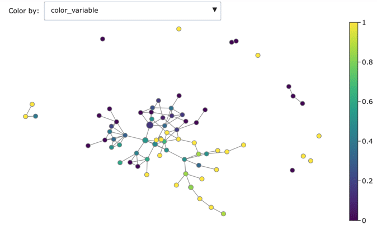
fig = plot_static_mapper_graph(pipe, X, color_by_columns_dropdown=True, color_variable=y)
fig.show(config={'scrollZoom': True})
This is the result:
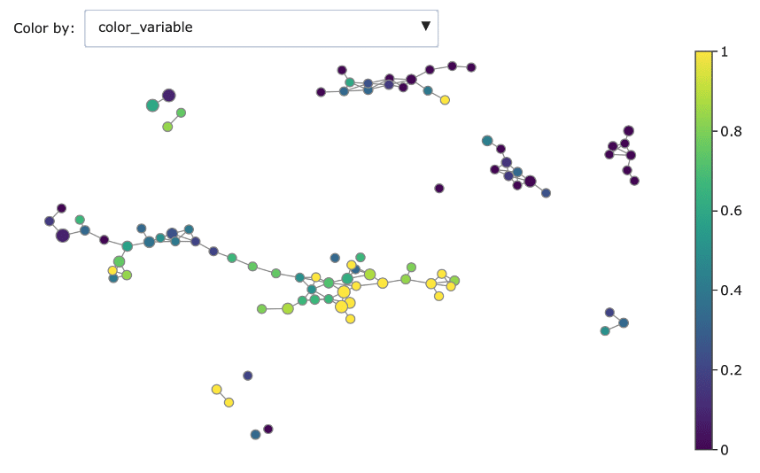
Mapper graph associated with the heart disease dataset. Nodes are coloured by ratio of disease.
Here we have used the UMAP two-dimensional embedding as lens function, we took a 2-dimensional covering with 10 intervals with 0.2 overlap and we clustered with DBSCAN.
We can see the topological structure forming some potentially interesting groupings in the Mapper graphs. Brighter points (from green to yellow) correspond to nodes with high concentration of heart disease while darker nodes have a majority of absence of heart disease. At a first sight we notice that heart disease concentrates in some regions of the graph, and separated groups of absence of disease form as well.
We can dig deeper in discriminating features using the associated colourings for understanding better the obtained groups:
-
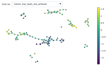
- Heart rate achieved
-
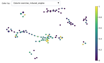
- Exercise induced angina
-
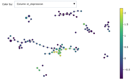
- ST depression
-
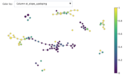
- ST slope upscoping
-
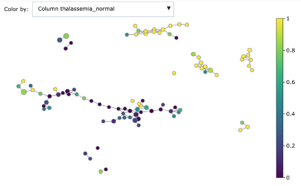
- Thalassemia normal
-
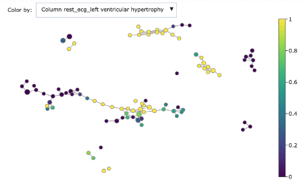
- Rest ECG left ventricular hypertrophy
As you can see, Mapper increases the explainability of data: different groups are characterized by defining features and ranges. For example, features correlated with heart disease seem reasonably to be ST depression, exercise induced angina and low max heart rate achieved.
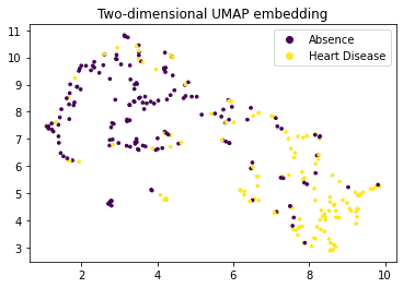
It is interesting to notice the difference with a simple UMAP projection: as mentioned in the strengths section, Mapper gives more structure and prevents projection loss by considering the pull-back of the cover.
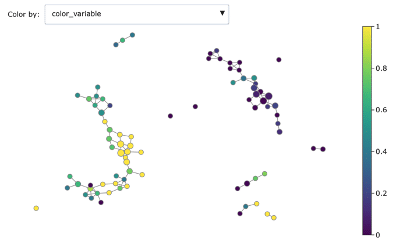
Changing from DBSCAN to hierarchical clustering changes some of the graph structure but keeps basically the splitting disease / no-disease. If we consider the projection to the first two PCA coordinates one major connected component appears where presence of heart disease shifts from one side to another (see figures below). It’s interesting to try different options and focus on the most meaningful ones.
-
- Mapper graph with hierarchical clustering
-
- Mapper graph with 3-components PCA lens
Conclusion
Mapper appears as a very promising data scientist tool either for research experimentation and for business intelligence. As our test shows, open-source libraries make it straightforward to exploit the method on complex data. Mapper graphs push one step further the exploration of data, generate interesting patterns to discover and allow to have new insights.
Its versatility enables it to adapt to different data sources, in particular images, texts, molecules, or any data with some specific underlying structure. Finally, the resulting graph improves explainability and can be used for further network analysis.
The author is grateful to Nicolas Brunel and Antoine Simoulin for reading carefully a preliminary version and for their valuable comments and remarks.
Willing to know more about graphs and networks? Then these blog articles could be interesting for you: Introduction to graph theory and its applications, Community detection, Identifying social network influencers.
